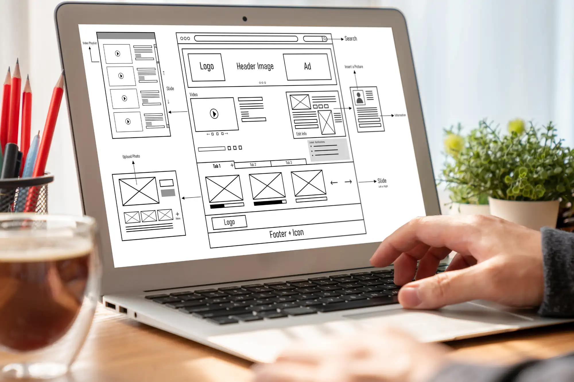
Your homepage has approximately seven seconds to capture a visitor’s attention before they decide whether to stay or leave. That’s less time than it takes to tie your shoes, yet it’s enough to determine whether that visitor becomes your next customer or bounces to a competitor’s site. A high-converting homepage doesn’t just look professional; it strategically guides visitors toward taking action, whether that’s making a purchase, scheduling a consultation, or signing up for your newsletter.
For small business owners competing against larger companies with bigger budgets, your homepage becomes even more critical. It’s your digital storefront, sales representative, and brand ambassador rolled into one. Every element needs to work together to build trust, communicate value, and make it remarkably easy for visitors to take the next step. Here’s how to transform your homepage from a passive brochure into an active conversion engine.
1. Start with a Crystal-Clear Value Proposition
Your value proposition is the foundation of homepage conversion. Within those crucial first seven seconds, visitors need to understand exactly what you offer, who you serve, and why they should care. This isn’t the place for clever wordplay or industry jargon that might confuse potential customers.
Position your value proposition prominently in the hero section—that prime real estate at the top of your homepage. Use a bold, benefit-focused headline that speaks directly to your target audience’s pain points or desires. Support it with a subheadline that provides additional context or elaborates on your unique approach. Then, pair these elements with a single, focused call-to-action that tells visitors exactly what to do next.
Consider this structure: Your headline identifies the primary benefit or transformation you provide. Your subheadline explains how you deliver that benefit or what makes your approach different. Your CTA button uses action-oriented language that creates urgency or promises value. Remember, specificity sells better than generalization. “Increase Your Local Search Rankings in 90 Days” carries more weight than “Improve Your SEO.”
Pro Tip: Test your value proposition with someone unfamiliar with your business. If they can’t explain what you do and why it matters after viewing your hero section for five seconds, it needs refinement.
2. Design for Scanners, Not Readers
Research shows that only 16% of visitors read web pages word-for-word. The vast majority scan, looking for information that catches their interest or answers their immediate questions. Your homepage design needs to accommodate this scanning behavior by making key information instantly accessible and digestible.
Break up your content into bite-sized chunks using short paragraphs of two to three sentences maximum. Use descriptive subheadings that allow visitors to jump to sections that interest them most. Bullet points and numbered lists make complex information easier to process quickly. Bold key phrases or statistics that support your value proposition, but use this technique sparingly to maintain its impact.
Visual hierarchy plays a crucial role in guiding scanners through your content. Use font sizes, colors, and spacing to create a clear path from your value proposition through supporting benefits to your call-to-action. Icons and illustrations can reinforce key points while adding visual interest that breaks up text-heavy sections. Infographics can communicate complex processes or data points more effectively than paragraphs of explanation.
White space, often overlooked, is your ally in creating a scannable homepage. It gives elements room to breathe, reduces cognitive load, and naturally draws attention to important content. Don’t feel compelled to fill every pixel—strategic emptiness can be more powerful than cluttered completeness.
3. Make Your Call-to-Action Impossible to Ignore
Your primary call-to-action deserves VIP treatment on your homepage. This is the one action you most want visitors to take, whether that’s starting a free trial, scheduling a consultation, or making a purchase. Every other element on your homepage should support and lead toward this primary goal.
Position your main CTA above the fold where it’s immediately visible without scrolling. Use a contrasting color that stands out from your overall color scheme—if your site uses primarily blue tones, an orange or green CTA button will naturally draw the eye. The button should be large enough to be easily clickable on mobile devices, with adequate padding around the text.
Your CTA copy matters as much as its design. Use action verbs that create momentum: “Start,” “Get,” “Discover,” “Transform.” Add urgency or value when appropriate: “Start Your Free 30-Day Trial” or “Get Your Custom Quote in Minutes.” Avoid generic phrases like “Submit” or “Click Here” that provide no context or motivation.
Repeat your primary CTA strategically throughout your homepage, especially after sections that build value or address objections. However, maintain consistency in both design and copy—changing the wording or appearance can confuse visitors and reduce conversions. Secondary CTAs for lower-commitment actions (like downloading a guide or joining a newsletter) should be visually distinct from your primary CTA to maintain clear hierarchy.
4. Leverage Social Proof to Build Instant Credibility
Trust is the currency of online conversion, and social proof is how you earn it quickly. Potential customers want reassurance that others have successfully worked with you before making their own commitment. Strategic placement of social proof elements throughout your homepage can significantly increase conversion rates.
Start with customer testimonials that speak to specific results or transformations. “Working with [Your Company] increased our online sales by 240% in six months” carries more weight than “Great service, highly recommend!” Include the customer’s name, company, and photo when possible to add authenticity. Video testimonials, though requiring more effort to obtain, can be particularly powerful in building trust.
Display logos of recognizable clients or partners prominently, ideally near your value proposition or primary CTA. If you’ve been featured in media outlets or industry publications, those logos serve as third-party endorsements. Certifications, awards, and professional associations add another layer of credibility, especially in industries where expertise and qualifications matter.
Quantifiable achievements make excellent social proof: number of customers served, years in business, aggregate results achieved for clients, or industry rankings. These numbers provide concrete evidence of your experience and success. Real-time social proof, such as recent customer activities or live visitor counts, can create urgency and demonstrate ongoing popularity.
5. Build Trust Through Professional, Purposeful Design
Design quality directly impacts perceived trustworthiness. A study by Stanford found that 75% of users judge a company’s credibility based on website design. This doesn’t mean you need cutting-edge animations or expensive custom graphics, but your homepage must look professional, current, and cohesive.
Maintain consistent branding throughout your homepage with a defined color palette, typography system, and visual style. Use high-quality, relevant images that reflect your actual business rather than generic stock photos everyone has seen before. If budget allows, invest in custom photography or illustrations that differentiate your brand and create authentic connections with visitors.
Ensure your homepage is fully responsive across all devices. With mobile traffic accounting for over half of all web visits, a homepage that looks broken or requires horizontal scrolling on smartphones immediately erodes trust and increases bounce rates. Test your design on multiple devices and browsers to ensure consistent experiences.
Page loading speed significantly impacts both user experience and conversion rates. Compress images, minimize code, and leverage browser caching to ensure your homepage loads in under three seconds. Every additional second of load time can reduce conversions by up to 7%, making speed optimization a critical design consideration.
6. Create Clear Pathways for Different Visitor Types
Not all homepage visitors arrive with the same intent or background knowledge. Some are discovering your business for the first time, others are returning to find specific information, and still others are ready to make a purchase decision. Your homepage needs to accommodate these different user journeys without creating confusion.
Use your main navigation to provide clear categories that match how visitors think about their needs, not how you organize your services internally. Include a “How It Works” or “What We Do” section for newcomers who need education before conversion. Provide quick links to popular resources, tools, or account access for returning visitors who know what they want.
Consider creating distinct pathways for different customer segments if you serve multiple audiences. For example, “Solutions for Startups” versus “Enterprise Services” immediately helps visitors self-select into relevant content paths. Use visual tiles, cards, or sections to make these options clear and inviting without overwhelming the overall design.
7. Optimize for Search Engines Without Sacrificing User Experience
A beautiful, high-converting homepage that no one can find won’t generate results. Search engine optimization ensures your ideal customers can discover your homepage when searching for solutions you provide. However, SEO should enhance, not compromise, user experience.
Incorporate your primary keywords naturally into your headline, subheadings, and body copy. Write meta titles and descriptions that accurately represent your homepage content while encouraging clicks from search results. Use descriptive alt text for images that helps both search engines and visually impaired users understand your visual content.
Create internal links to important pages using descriptive anchor text that provides context about the destination. This helps search engines understand your site structure while giving visitors clear pathways to explore further. Include schema markup to help search engines better understand and display your business information in search results.
8. Continuously Improve Through Data-Driven Optimization
Your homepage is never truly “done”—it should evolve based on actual visitor behavior and conversion data. Implement analytics tools to track key metrics like bounce rate, time on page, scroll depth, and conversion rates for different traffic sources.
Use heat mapping tools to see where visitors click, how far they scroll, and which elements capture attention. Session recordings can reveal friction points where visitors struggle or abandon your site. This qualitative data often reveals insights that pure numbers miss.
Run A/B tests on critical elements like headlines, CTA buttons, testimonial placement, or value proposition messaging. Test one element at a time to clearly understand what drives improvement. Even small gains compound over time—improving conversion rate from 2% to 2.5% represents a 25% increase in results.
Your Homepage Is Your Hardest-Working Employee
Think of your homepage as an employee who never takes a break, never calls in sick, and can handle unlimited conversations simultaneously. Like any valuable team member, it deserves ongoing investment, training, and optimization to perform at its best.
The strategies outlined here provide a framework for homepage success, but remember that your specific audience and industry may require unique approaches. What works for an e-commerce site might not suit a B2B service provider. Test, measure, and refine based on your actual results rather than assumptions.
Creating a high-converting homepage isn’t about following a rigid template—it’s about understanding your visitors’ needs, removing friction from their journey, and making it remarkably easy for them to say yes to your offer. Every element should serve a purpose, whether that’s building trust, communicating value, or driving action.
At Joshua Smith Digital, we specialize in creating homepages that don’t just look impressive—they deliver measurable business results. If your homepage isn’t generating the leads and sales your business deserves, let’s discuss how strategic design improvements can transform your online presence into a conversion powerhouse.